


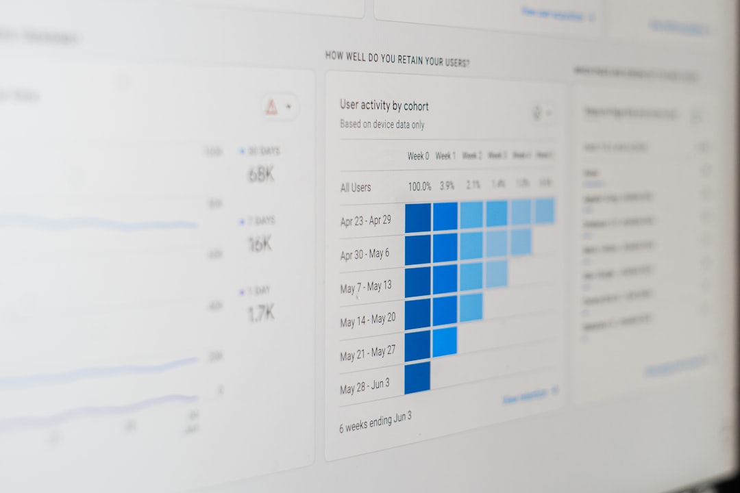
User behavior is a crucial aspect of digital marketing and content creation. It encompasses how visitors interact with your website, what they click on, how long they stay, and where they lose interest. By understanding these patterns, you can tailor your content to better meet the needs and preferences of your audience. This understanding goes beyond mere statistics; it involves interpreting the data to gain insights into user motivations and preferences.
For instance, if you notice that users frequently abandon your blog posts after a certain point, it might indicate that the content is either too lengthy or not engaging enough. Conversely, if users are spending a lot of time on specific sections, it suggests that those topics resonate well with your audience. By analyzing these behaviors, you can make informed decisions about content creation and layout, ultimately leading to a more effective online presence.
Key Takeaways
- Users tend to scroll quickly through blog content, making it important to understand their behavior and engagement patterns.
- Blog scroll heat maps are crucial for understanding how users interact with content and identifying popular sections.
- Scroll heat maps work by tracking user scrolling behavior and visually representing engagement levels on different parts of the blog.
- Analyzing user engagement through scroll heat maps helps in identifying popular content and improving content strategy.
- By tracking user attention and identifying popular content, businesses can enhance user experience and increase conversion rates.
Importance of Blog Scroll Heat Maps
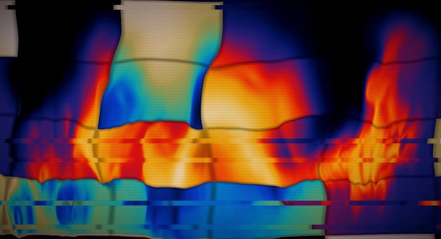
Blog scroll heat maps are powerful tools that visually represent how users interact with your content. They provide a clear picture of where readers are focusing their attention and how far down the page they scroll. This information is invaluable for bloggers and marketers alike, as it helps identify which parts of a post are engaging and which are being ignored.
The importance of these heat maps lies in their ability to highlight user engagement in a straightforward manner. Instead of sifting through raw data or analytics reports, heat maps offer an intuitive visual representation that makes it easy to spot trends and patterns. This can lead to more effective content strategies, as you can quickly identify what works and what doesn’t.
How Blog Scroll Heat Maps Work
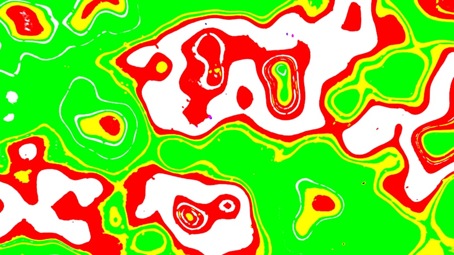
Scroll heat maps work by tracking user interactions on your blog pages. When a visitor scrolls through your content, the heat map records their movements and clicks, creating a visual representation of engagement levels across different sections of the page. Areas where users spend more time or scroll further down are highlighted in warmer colors, while less engaged areas appear cooler.
The technology behind these heat maps typically involves JavaScript tracking codes embedded in your blog. These codes collect data on user behavior without being intrusive, ensuring that the user experience remains smooth. Once the data is collected, it is processed and displayed in a way that allows you to easily interpret user engagement patterns.
Analyzing User Engagement
Analyzing user engagement through scroll heat maps can reveal a wealth of information about how your audience interacts with your content. For example, you might find that users tend to drop off after the first few paragraphs or that they linger on images or videos. This analysis can help you understand what captures attention and what fails to hold it.
Moreover, engagement analysis can inform your content strategy moving forward. If certain topics or formats consistently attract more attention, you can prioritize those in future posts. Additionally, understanding where users lose interest can guide you in restructuring your content to maintain engagement throughout the entire piece.
Identifying Popular Content
| Blog Section | Percentage of Users Scrolling | Time Spent on Section |
|---|---|---|
| Introduction | 80% | 1 minute |
| Main Content | 60% | 3 minutes |
| Conclusion | 40% | 30 seconds |
One of the most significant advantages of using scroll heat maps is the ability to identify popular content within your blog. By examining which sections receive the most attention, you can pinpoint topics that resonate with your audience.
This insight allows you to create more targeted content that aligns with user interests.
For instance, if a particular blog post consistently shows high engagement in a specific section, it may be worth exploring that topic further in future articles. Alternatively, if certain subjects are consistently overlooked, it might be time to reconsider how you present them or whether they should be part of your content strategy at all.
Tracking User Attention
Tracking user attention is essential for understanding how effectively your content communicates its message. Scroll heat maps provide a clear view of where users are focusing their attention and for how long. This information can help you assess whether your headlines are compelling enough or if your calls to action are placed effectively.
By monitoring user attention over time, you can also identify trends in how engagement changes with different types of content or layouts. For example, if you notice that users are increasingly scrolling past certain sections, it may indicate a need for a refresh in your writing style or visual elements. Keeping an eye on these shifts can help you stay ahead of user preferences.
Improving Content Strategy
With insights gained from scroll heat maps, improving your content strategy becomes a more data-driven process. You can use the information to refine your approach to topics, structure, and even design elements within your blog posts. For instance, if users tend to engage more with shorter paragraphs or bullet points, you might consider adopting this style more frequently.
Additionally, understanding which types of content lead to higher engagement can help you allocate resources more effectively. If video content consistently outperforms written articles in terms of user interaction, it may be worth investing more time and effort into creating multimedia posts. This strategic approach ensures that your content remains relevant and engaging for your audience.
Enhancing User Experience
Enhancing user experience is at the heart of any successful blog or website. By utilizing scroll heat maps, you can identify pain points in the user journey and make necessary adjustments to improve overall satisfaction. For example, if users frequently scroll past important information without engaging with it, you might need to rethink how that information is presented.
Moreover, understanding user behavior allows you to create a more intuitive layout that guides readers through your content seamlessly. By placing key information in areas where users are most likely to engage, you can enhance their experience and encourage them to explore more of your site.
Increasing Conversion Rates
Ultimately, one of the goals of any blog or website is to increase conversion rates—whether that means getting users to sign up for a newsletter, purchase a product, or engage with your brand in some way. Scroll heat maps can play a significant role in achieving this goal by providing insights into how users interact with calls to action (CTAs).
By analyzing where users tend to click or scroll away from CTAs, you can optimize their placement and design for maximum impact. For instance, if a CTA placed at the bottom of a long post receives little attention, consider moving it higher up on the page or making it more visually prominent. Small adjustments based on heat map data can lead to significant improvements in conversion rates.
Utilizing Scroll Heat Maps for Marketing
Incorporating scroll heat maps into your marketing strategy can provide a competitive edge in understanding audience behavior. By analyzing how users interact with various marketing materials—such as landing pages or promotional blog posts—you can refine your messaging and design for better results.
For example, if a particular marketing campaign shows high engagement in certain sections but low conversion rates, it may indicate that while users are interested in the content, they may not be compelled to take action. This insight allows you to adjust your approach and test new strategies based on real user behavior rather than assumptions.
Best Practices for Implementing Scroll Heat Maps
To make the most out of scroll heat maps, there are several best practices to keep in mind. First and foremost, ensure that you choose a reliable tool that integrates well with your existing analytics setup. Look for features that allow for easy visualization and interpretation of data.
Next, regularly review and analyze the data collected from heat maps. Trends can change over time as audience preferences evolve, so staying updated will help you adapt your strategy accordingly. Finally, don’t hesitate to experiment with different layouts and content styles based on insights gained from heat maps; testing new approaches can lead to unexpected successes.
In conclusion, understanding user behavior through tools like blog scroll heat maps is essential for creating engaging content and improving overall user experience. By analyzing engagement patterns and identifying popular content, you can refine your strategies and ultimately drive better results for your blog or website.
FAQs
What is a blog scroll heat map?
A blog scroll heat map is a visual representation of how users interact with a blog post by showing where they scroll and how far down the page they read.
How is a blog scroll heat map useful?
A blog scroll heat map is useful for understanding user behavior and engagement with a blog post. It can help identify which parts of the content are most engaging and which sections may need improvement.
What insights can be gained from a blog scroll heat map?
A blog scroll heat map can provide insights into user engagement, such as identifying the most and least read sections of a blog post, determining if users are scrolling past important content, and understanding the overall effectiveness of the layout and structure of the post.
How is a blog scroll heat map created?
A blog scroll heat map is typically created using specialized software or tools that track user behavior on a webpage. These tools collect data on how users interact with the content and then generate a visual representation of the scroll behavior.
What are the benefits of using a blog scroll heat map?
The benefits of using a blog scroll heat map include gaining a deeper understanding of user behavior, optimizing content layout and structure, improving user engagement, and ultimately enhancing the overall effectiveness of blog posts.


0 Comments