


Heat maps are powerful tools that can provide valuable insights into how users interact with your blog. By visually representing data, heat maps allow you to see where visitors click, how far they scroll, and which areas of your content attract the most attention. This information is crucial for bloggers and content creators who want to enhance user engagement and optimize their websites for better performance.
In a world where attention spans are short, understanding user behavior is key to keeping readers on your site longer. Heat maps can help you identify trends and patterns in user interaction, enabling you to make informed decisions about your content and layout. Whether you’re a seasoned blogger or just starting out, leveraging heat maps can significantly improve your blog’s effectiveness.
Key Takeaways
- Heat maps provide valuable insights into user behavior on blogs
- Popular content can be identified using heat maps
- Blog layout and design can be optimized using heat maps
- Click patterns and scroll behavior can be analyzed with heat maps
- Call-to-action placement can be improved using heat maps
Understanding User Behavior with Heat Maps
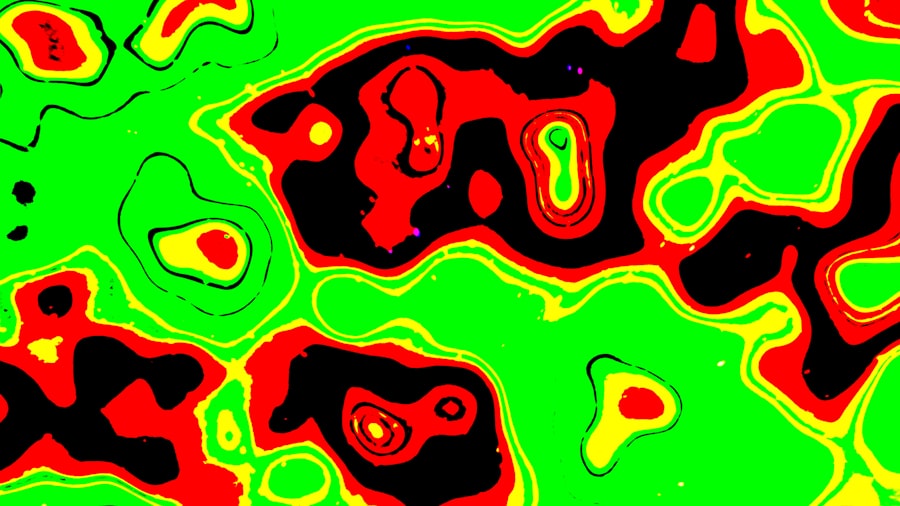
To truly benefit from heat maps, it’s essential to grasp how they reflect user behavior. Essentially, heat maps use color gradients to indicate areas of high and low activity on your blog. Warmer colors like red and orange signify high engagement, while cooler colors like blue and green indicate less interaction. This visual representation makes it easy to pinpoint which sections of your blog are capturing attention and which are being overlooked.
By analyzing these patterns, you can gain insights into what draws readers in. For instance, if a particular section of your blog consistently shows high engagement, it may indicate that the content resonates well with your audience. Conversely, if certain areas are frequently ignored, it might be time to rethink your approach or content strategy. Understanding these behaviors allows you to tailor your content to better meet the needs and preferences of your readers.
Using Heat Maps to Identify Popular Content
One of the most practical applications of heat maps is identifying which pieces of content are most popular among your audience. By examining the areas where users spend the most time or click the most, you can determine which topics or formats resonate best. This information is invaluable for content planning and can guide your future writing efforts.
For example, if a specific blog post garners a lot of clicks and engagement, it may be worth creating similar content or expanding on that topic in future posts. On the other hand, if certain articles receive little attention, it might be an indication that they need to be revised or promoted differently. Heat maps provide a clear visual representation of this data, making it easier to make strategic decisions about your content.
Optimizing Blog Layout and Design with Heat Maps
The layout and design of your blog play a significant role in user engagement. Heat maps can help you assess how effectively your design elements are working. For instance, if you notice that users are frequently clicking on images or buttons in specific areas, it may indicate that those elements are well-placed and engaging.
Conversely, if certain sections of your blog are receiving little interaction, it might be time to rethink their placement or design. Perhaps a call-to-action button is buried too far down the page or an important image is overshadowed by other elements. By using heat maps to analyze these aspects, you can create a more intuitive and engaging layout that encourages users to explore further.
Analyzing Click Patterns and Scroll Behavior with Heat Maps
| Metrics | Description |
|---|---|
| Click Heat Map | Shows where visitors are clicking the most on your website |
| Scroll Heat Map | Indicates how far down the page visitors are scrolling |
| Mouse Movement Heat Map | Displays where visitors are moving their mouse on the page |
| Attention Heat Map | Highlights the areas of the page that receive the most attention |
Click patterns and scroll behavior are two critical components of user engagement that heat maps can illuminate. By examining where users click most frequently, you can identify which links or buttons are most appealing.
This information can help you refine your navigation and ensure that important content is easily accessible.
Scroll behavior is equally important; it reveals how far down the page users typically go before losing interest. If you find that most visitors only scroll halfway through your posts, it may be a sign that your content needs to be more engaging or that key information should be placed higher up on the page. Understanding these patterns allows you to create a more user-friendly experience that keeps readers engaged from start to finish.
Improving Call-to-Action Placement with Heat Maps
Call-to-action (CTA) buttons are essential for driving conversions on your blog, whether you’re looking for newsletter sign-ups, product purchases, or social media shares. Heat maps can provide insights into the effectiveness of your CTAs by showing where users are clicking and how often they engage with these prompts.
If you notice that a CTA button is receiving little attention, it may be time to experiment with its placement or design. Perhaps moving it higher up on the page or changing its color could make it more noticeable. Additionally, analyzing click patterns can help you determine which wording resonates best with your audience. By optimizing your CTAs based on heat map data, you can significantly improve conversion rates.
Utilizing Heat Maps for A/B Testing and Conversion Rate Optimization
A/B testing is a valuable strategy for optimizing your blog’s performance, and heat maps can play a crucial role in this process. By comparing two different versions of a page or post, you can see which one performs better in terms of user engagement and conversions. Heat maps provide visual feedback on how users interact with each version, helping you make data-driven decisions.
For instance, if you’re testing two different headlines or layouts, heat maps can reveal which version captures more clicks or keeps users scrolling longer. This information allows you to refine your approach continually and make adjustments based on real user behavior rather than assumptions. Ultimately, this leads to a more effective blog that meets the needs of your audience.
Tracking User Engagement on Mobile Devices with Heat Maps
With an increasing number of users accessing blogs via mobile devices, understanding mobile engagement is crucial. Heat maps can help you track how mobile users interact with your content differently than desktop users. This insight is vital for optimizing the mobile experience and ensuring that your blog is accessible and engaging across all devices.
For example, you might find that mobile users tend to click on different elements than desktop users or that they scroll differently through content. By analyzing these patterns, you can make necessary adjustments to improve the mobile experience—whether that’s simplifying navigation or ensuring that CTAs are easily clickable on smaller screens.
Enhancing User Experience with Heat Maps
Ultimately, the goal of using heat maps is to enhance the overall user experience on your blog. By understanding how users interact with your content, you can create a more intuitive and enjoyable browsing experience. This not only keeps readers engaged but also encourages them to return for more.
Heat maps allow you to identify pain points in the user journey—areas where visitors may be getting stuck or frustrated. By addressing these issues, whether through improved navigation or clearer content organization, you can create a smoother experience that fosters loyalty among your audience.
Measuring the Effectiveness of Blog Engagement Strategies with Heat Maps
As you implement various engagement strategies on your blog, it’s essential to measure their effectiveness over time. Heat maps provide a clear way to track changes in user behavior as you make adjustments to your content and layout. By comparing heat maps before and after implementing new strategies, you can see what works and what doesn’t.
This ongoing analysis allows you to refine your approach continually and stay responsive to your audience’s needs. Whether you’re experimenting with new content formats or adjusting your design elements, heat maps offer valuable feedback that helps you gauge success and make informed decisions moving forward.
Harnessing the Power of Heat Maps for Blog Engagement
In conclusion, heat maps are an invaluable tool for bloggers looking to enhance user engagement and optimize their content strategy. By providing insights into user behavior, popular content, layout effectiveness, and more, heat maps empower you to make data-driven decisions that improve the overall experience for your readers.
As you explore the various applications of heat maps—from analyzing click patterns to optimizing CTAs—remember that the ultimate goal is to create a blog that resonates with your audience. By harnessing the power of heat maps, you can build a more engaging and effective platform that keeps readers coming back for more.
FAQs
What are website heat maps for bloggers?
Website heat maps for bloggers are visual representations of user interaction on a website, showing where users click, scroll, and spend the most time. These heat maps help bloggers understand user behavior and optimize their website for better user experience and engagement.
How do website heat maps benefit bloggers?
Website heat maps provide valuable insights into user behavior, allowing bloggers to identify popular and underperforming areas of their website. This information can be used to make data-driven decisions to improve website layout, content placement, and call-to-action buttons, ultimately leading to increased engagement and conversions.
What types of website heat maps are available for bloggers?
There are several types of website heat maps available for bloggers, including click maps, scroll maps, and move maps. Click maps show where users click the most, scroll maps indicate how far users scroll down a page, and move maps track mouse movement and hover behavior. Each type of heat map provides unique insights into user interaction.
How can bloggers use website heat maps to improve their websites?
Bloggers can use website heat maps to identify areas of high and low user engagement, optimize content placement and layout, test the effectiveness of call-to-action buttons, and understand user behavior patterns. By analyzing heat map data, bloggers can make informed decisions to improve website performance and user experience.
Are there any tools available for bloggers to create website heat maps?
Yes, there are various tools available for bloggers to create website heat maps, such as Hotjar, Crazy Egg, and Mouseflow. These tools offer features like heat mapping, session recording, and user feedback collection, allowing bloggers to gain valuable insights into user behavior and make informed website optimization decisions.


0 Comments